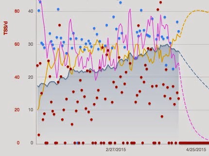
Blue line - Fitness
Pink line - Fatigue
Yellow line - Rest
Red dots - Training Stress Scores (based on pace and HR data) with the highest red dot being the recent 18 miler
Blue dots - I forgot
Almost all of this data is paced on pace, not HR since I didn't actually track HR for most of my workouts. There were also workouts on the bike where I didn't record TSS, so that messes things up just a bit. However, the overall trends are still evident.
What we want in taper:
- Pink line dropping - it is definitely on the way down
- Yellow line rising - it is currently at its highest point in months
So things are looking good here. Should be in a good place for Monday coming up. Cautiously optimistic.
No comments:
Post a Comment